
Purpose:
In LoadRunner, the error graph helps a performance tester to understand what the error came during the performance test. The error graph gives a detailed picture of what and when errors come. This graph is very much useful when you merge with other graphs like average response time, throughput, latency or even with the running vusers graph.
To start the investigation on bottlenecks you should apply WHIWH rule first:
- What errors come
- How many errors come
- In which condition do errors come
- When errors come
- How long do errors persist
Graph Axes Representation:
- X-axis: This graph has elapsed time on the X-axis. The elapsed time may be relative time or actual time as per the graph’s setting. This also shows the complete duration of your test (without filter).
- Y-axis: Number of Errors during the test
How to read:
The graph line shows a count of errors during the test in the per-second interval. LoadRunner gives an error code with respect to each error. You can get the actual error statement by referring ‘Errors per Second (by Description) Graph’.
LoadRunner provides below error graphs:
- Errors per Second (by Description) Graph: To display the average number of errors that occurred during each second of the test run, grouped by error description.
- X-axis: This graph has elapsed time on the X-axis. The elapsed time may be relative time or actual time as per the graph’s setting. This also shows the complete duration of your test
- Y-axis: Number of Errors during the test

- Errors per Second Graph: To display the average number of errors that occurred during each second of the test run, grouped by error code.
- X-axis: This graph has elapsed time on the X-axis. The elapsed time may be relative time or actual time as per the graph’s setting. This also shows the complete duration of your test
- Y-axis: Number of Errors during the test

- Error Statistics (by Description) Graph: To display the number of errors that accrued during test execution, grouped by error description. This is a pie chart.

- Error Statistics Graph: To display the number of errors that accrued during test execution, grouped by error code. This is a pie chart.

- Total Errors per Second Graph: To display the total number of errors (not categorized) that occurred during each second of the test run.
- X-axis: This graph has elapsed time on the X-axis. The elapsed time may be relative time or actual time as per the graph’s setting. This also shows the complete duration of your test
- Y-axis: Number of Errors during the test

Merge Error Graph with other graphs:
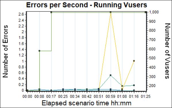
1. With no. of users graph: You can merge the error per second graph with running Vuser graph to get the exact time and user count when an error occurred.
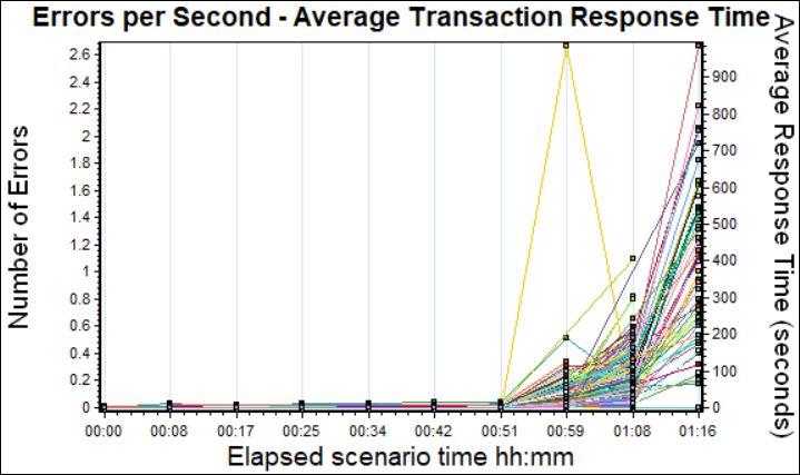
2. With Response Time graph: The average transaction response time graph can be correlated with the error per second graph to see the effect of errors on transaction performance time.
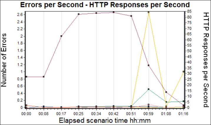
3. With HTTP Responses Code graph: Response Code graph can be correlated with error per second graph to see which HTTP code and error was received at what time.
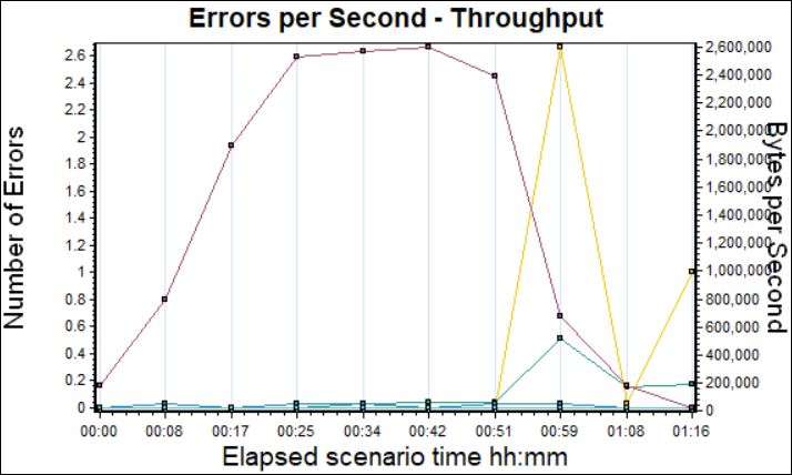
4. With Throughput: The error graph can be merged with the Throughput graph so that you can get the effect of errors on server data.
You may be interested:
- Performance Testing Tutorial
- Performance Engineering Tutorial
- Apache JMeter Tutorial
- Neotys NeoLoad Tutorial