
I always consider Test Analysis as the most important and technical part in performance testing rather than scripting and execution. Performance test result analysis requires your actual expertise. During the analysis phase, you can determine bottleneck and remediation options at an appropriate level – business, middleware, application, infrastructure, network etc. The LoadRunner Analysis tool is really helpful to conduct your analysis on the test result. This tool converts the row test result data into a human-readable format and displays the result through tables, graphs etc. which helps to detect the bottleneck. Such graphs enable you to view and understand the data and analyse system performance after a test run. Analysing the graphs in single and separate windows makes analysis work hectic and time-consuming.
To overcome this problem the LoadRunner Analysis Tool has an option to merge the graphs. Using this option you can merge different graphs and draw a conclusion of the test. LoadRunner Analysis Tool has 3 types of merging graph options which are:
- Overlay
- Correlate
- Tile
Most of the performance testers are always confused with the Overlay and Correlate options. After reading this blog you come to know the difference between the overlay and correlate graph option along with the tile graph option.
How to merge the graphs in the LoadRunner Analysis Tool?
Graph merging gives more meaningful information rather than analysing the graphs separately. Let’s see how graphs are merged. Before you open the graph merging option, ensure you have at least one graph opened already, that you wish to merge. The tool will assume you want to add another graph to the already opened graph. To open the merge graph window:
- Either select the graph and right-click on it OR Go to ‘View’ in the main menu
- Click on ‘Merge Graphs…’

After clicking on ‘Merge Graphs…’ a pop-up will open with a list of graphs to be merged with:

The above figure shows the merging of the Running Vuser graph with the Hits per Second graph.
Select the type of merging by choosing the appropriate merge option

The analysis tool gives a default name to the newly formed merged graph. You can rename the graph by providing an appropriate name in the ‘Title of merged graph’ section. The below figure shows an overlay merged graph of Running Vusers and Hits per Second:

What is an Overlay Graph?
The overlay option merges the contents of two graphs that share a common X-axis. The left Y-axis on the merged graph shows the current graph’s values. The right Y-axis shows the values of the graph that was merged. In the below snapshot:
- Throughput is a current graph, indicated on the left Y-axis
- Hits per second is a merged graph, indicated on the right Y’-axis
- Elapsed Scenario Time is shared by both graphs on the X-axis
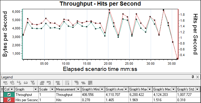
There is no limit to the number of graphs that you can overlay. When you overlay two graphs, the Y-axis for each graph is displayed separately to the right and left of the graph. When you overlay more than two graphs, Analysis displays a single Y-axis, scaling the different measurements accordingly. Importance of Overlay Graph:
- It gives a single picture of all merged graphs along with a shared x-axis.
- Easy to identify bottleneck time while using elapsed scenario time as an X-axis
- Multiple graphs can be added
Note: In an ideal scenario, if metrics are directly proportional then y-axis graph lines should follow each other. Otherwise, the opposite trend should be followed in case metrics are inversely proportional.
Example: During steady-state, Throughput and Hits per second graphs follow each other while Errors per second and Average Response Time graphs follow the opposite direction.
What is a Correlate Graph?
Correlate option plots the Y-axis of two graphs against each other. The current graph’s Y-axis becomes the X-axis of the merged graph. The Y-axis of the graph that was merged, becomes the merged graph’s Y-axis. In the below snapshot:
- Throughput is a current graph, indicated on X-axis
- Hits per second is a merged graph, indicated on the Y-axis
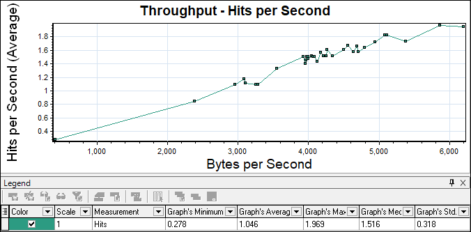
Importance of Correlate Graph:
- Graphs are plotted against each other helps to identify bottlenecks at a particular time.
- Having different measurements of correlate option
Note: Linear line in forwarding direction indicates good results. Step-up, step-down and spike correlate graphs require investigation.
What is a Tile Graph?
Using the Tile option you can view the contents of two graphs that share a common x-axis in a tiled layout, one above the other. The Y-axis is divided into sections while the X-axis is shared by all the graphs. In the below snapshot:
- Throughput is a current graph, indicated on the lower portion
- Hits per second is a merged graph, indicated on the upper portion
- Elapsed Scenario Time is shared by both graphs on the X-axis
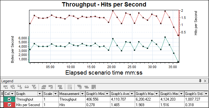
Importance of Tile Graph:
- It gives a single picture of all merged graphs along with a shared X-axis.
- Easy to identify bottleneck time while using elapsed scenario time as an X-axis
Note: In an ideal scenario, if metrics are directly proportional then graph lines should follow each other. Else the opposite trend should be followed in case metrics are inversely proportional.
Example: During steady state, the Throughput and Hits per second graphs follow each other while the Errors per second and Average Response Time graphs follow the opposite direction.
You may be interested:
- Performance Testing Tutorial
- Performance Engineering Tutorial
- Apache JMeter Tutorial
- Neotys NeoLoad Tutorial