
Purpose:
The LoadRunner Running Vusers graph provides complete information on how many users are active or running at any particular time of the test. It means this graph provides information about the number of users currently accessing the application. This is a simple but very important graph. I am saying it is ‘simple’ because you can easily read this graph if you have basic knowledge of reading a graph. Now, I am saying this is an important graph because this graph is merged with many other graphs like error per second, throughput, latency, response time graph etc. to identify the bottleneck.
Axis Representation:
- X-axis: This graph has elapsed time on the X-axis. The elapsed time may be relative time or actual time as per the graph’s setting. This also shows the complete duration of your test. When you apply the ‘Scenario Elapsed Time’ filter, the X-axis shows the time only for the selected duration.
- Y-axis: It has No. of Users count.
How to read:
The graph line shows the ramp-up, ramp-down and steady-state of the test. Ramp-up when users gradually increase, ramp-down when users gradually decrease and steady-state is a window in which you want to monitor system behaviour. Steady-state for a normal load test is a flat line whereas for a break-point test, it’s like a ramp-up pattern and for a spike test it’s a pattern form a zigzag.
Refer to the below figure. Here you can check at what point of time how many virtual users are active.

Merging of ‘Running Vuser Graph’ with other graphs:
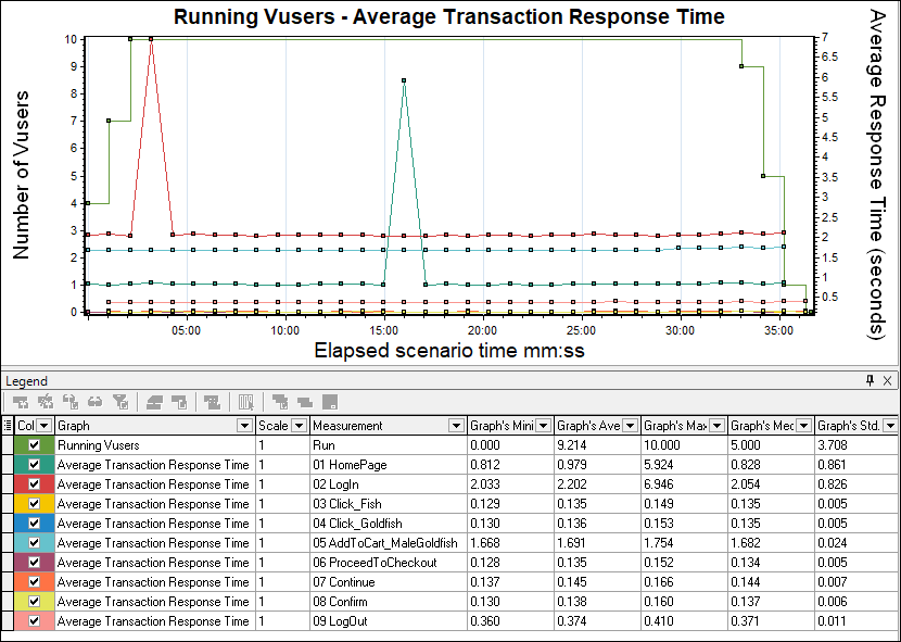
- With Average Transaction Response Time graph: In the Analysis tool, you can correlate the Running Vuser graph with the Average Transaction Response Time graph to see how the number of Running Vusers affects the transaction performance time. Normally, the Average Transaction Response Time of the transactions in the graph should have very little deviation. I won’t say the average response time should be constant because that is an ideal condition. In some cases, average response time increases or decreases at the beginning or during the test then merge this graph with the Running Vuser graph to understand the impact of user load on the server response time. Sometimes you can see a sudden drop in the average response time and when you merge with the Running Vuser graph you come to know that some of the Vusers exited at the same time.
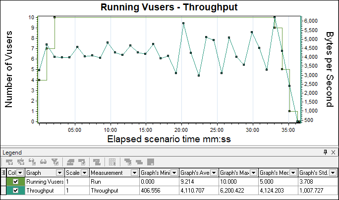
- With Throughput graph: Running the Vuser graph can be correlated with the Throughput graph. Refer to the below figure which shows increased throughput at the beginning of the test followed by reduced throughput towards the end. This graph would need careful analysis. In case of an issue like a throughput drop, it is important to investigate whether it is a network bandwidth issue or this throughput drop is due to the server failure which leads failure of the Vuser. Hence merging the throughput graph with the Running Vuser graph provides a clue to differentiate between network and server issues. In the below overlay graph, you can see Throughput at Y’-axis while the number of users at the Y-axis. The elapsed time is represented on the X-axis.
- With Error Graph: Running the Vuser graph when overlaid with the error/second graph you can easily identify the exact time when the first error occurred as well as the time till the error lasts. Commonly, an increase in error % during ramp-up indicates an error due to load. If an error is identified during the steady state then this indicates queue pile-up at the server (a large number of unprocessed requests at the server end). As I said, before making any conclusion you have to investigate properly by referring to different analysis graphs as well as by merging them together. This graph is not available in the absence of an error in the test.

Note: You can merge the Running Vuser graph with other analysis graphs too. Above I have shown you the merging of the Running Vuser graph with important graphs only and what are the purpose of merging them together.
You may be interested: