Purpose:
The primary purpose of reading throughput graph is to identify network bandwidth issues. A simple thumb rule to detect network bandwidth issues is:
If the throughput scales upward as time progresses and the number of Vusers increase, this indicates that the bandwidth is sufficient. If the graph were to remain relatively flat as the number of Vusers increased, it would be reasonable to conclude that the bandwidth is constraining the volume of data delivered
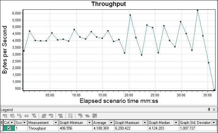
Apart from the network bandwidth issue, the throughput graph shows the amount of data transferred from server to client and it is measured in terms of bytes, KB or MB.
Axes represent:
- X-axis: This graph shows elapsed time on the X-axis. The elapsed time may be relative time or actual time as per the setting of the graph. The X-axis of the graph also shows the complete duration of the test (without applying any filter).
- Y-axis: It represents the amount of data received from server to client (in bytes/KB/MB)
How to read:
The graph line shows how much amount of data is sent by the server in per-second intervals. As I explained in the graph’s purpose section using a throughput graph you can get an idea of network bandwidth issues (if any). A flat throughput graph with an increase in network latency and user load shows an issue in network bandwidth. Apart from this if throughput scales downward as time progresses and the number of users (load) increases, this indicates that the possible bottleneck is at the server end. In that case, you need to merge the throughput graph with the error graph, user graph and response time graph to identify the exact bottleneck.
Merging of Throughput graph with others:
- With Running Vuser graph: Merge Running Vuser graph with the Throughput graph and understand the pattern. Ideally, throughput should increase during the user ramp-up period. As the number of users progresses, more data comes from the server. The throughput graph should remain in a range during the steady state of the test. If you observe a sudden fall in the throughput graph during the steady state of the test then it indicates the server-side issue. What is the issue? You need to investigate using server logs.
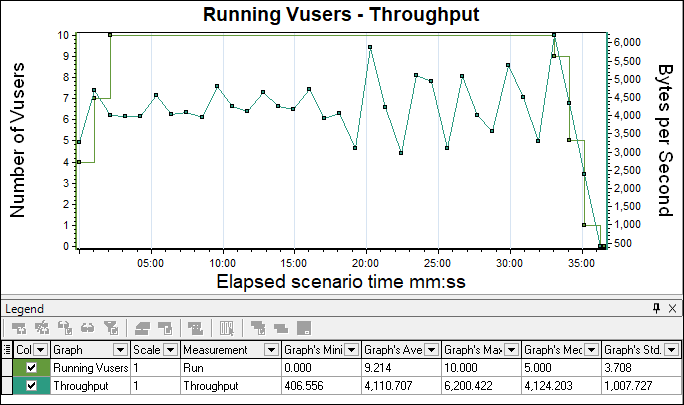
Another scenario is when throughput becomes flat while increasing the number of users then it may lead to the bandwidth issue. To confirm the bandwidth issue you need to merge the throughput graph with Latency.

- With Network Latency graph: To confirm the network bandwidth issue you have to look into the Network latency graph by merging it with the throughput graph. If latency increases without an increase in throughput then it’s a Network Bandwidth issue.

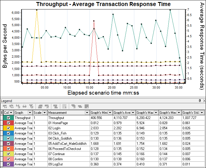
- With Average Transaction Response Time graph: Response Time graph can be correlated with the Throughput graph. The increase in response time with constant throughput may be due to network bandwidth issues. To confirm please refer Latency graph. If you see throughput degradation with an increase in response time then start the investigation at the server end.
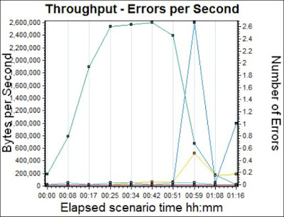
- With Error per second graph: A throughput graph can be merged with an error per second graph to identify the point when an error starts to occur and what type of error.
You may be interested:
- Performance Testing Tutorial
- Performance Engineering Tutorial
- Apache JMeter Tutorial
- Neotys NeoLoad Tutorial