The definition of Trend represents “a general direction in which something is developing or changing”. Trend analysis method can be applied to client, server and network metrics. Before understanding the Trends method, it is good to know about the WHIWH rule. Now, let’s get started with how you can understand the graph and identify the bottleneck using the Trend method:
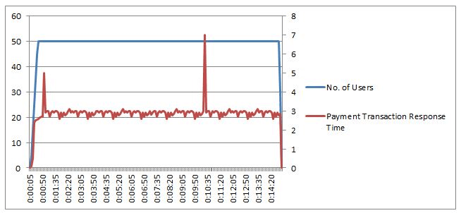
1. Consistent Trend:
Below is an example of a consistent trend. You can see the response time of Payment Transaction is consistent (<0.1 standard deviations) with a constant no. of users. Such trending graphs show no bottleneck with a given load; provided that the response time SLA should meet.

2. Consistent with Fluctuation (not Spike):
In such a case, you can see the fluctuations over a long duration, but the graph is very much consistent (<0.2 standard deviations). This may be a bottleneck if breaches the SLA. Example: You have a Payment transaction response time SLA is 3 seconds with 0% tolerance, but fluctuation reaches 3.6 seconds then it breaches the SLA.
If 3.6 seconds is well-fitted in the SLA (with some tolerance limit), then you can ignore it.
But, why did fluctuation happen? This is pointing to code bottleneck and very unlikely the hardware or software resource issues.

3. Consistent with Spikes:
Refer to the below graph, you can see 2 spikes during the performance test, although response time is consistent throughout the test except for these spikes. Does this spike create any problems? Now, it depends upon what type of system it is and what is acceptable here. If you calculate the 95th percentile, then you will see it is 3 seconds and under the SLA acceptance limit. But, what is causing the spikes? The spikes can be due to inadequate resources in the system like threads. Some of the suggestions to analyze the bottleneck are to look at the server resources like threads, GC, CPU Utilization, Connections, process memory, DB resources, cache etc.
4. Regular Peaks:
In this scenario, you can see regular peaks in response time. The trend here points to a resource bottleneck. How do we know what resource is the bottleneck here? It doesn’t seem to be really caused by the user load itself. So some resource which is time-bound or user bound with the load could be the bottleneck. One of the possible culprits can be a potential load balancing issue. A thorough investigation of the bottleneck helps to find out the actual root cause. You can use the Correlation method for root cause analysis.

5. Increasing Trend:
Refer to the below graph, it shows an increasing response time trend with user load. Under a smaller user load, response times are within the acceptable limit, but it started increasing exponentially when the user load was around 40. At the constant load of 50 users, response time fluctuated between 2 to 9.5 seconds. It indicates that the system can able to scale up to 40 users without degrading the performance, after which it is not able to scale. It points to hardware or software capacity issues and is advised to look at resource utilisation and queuing at different application tiers. Network bandwidth issues may be one of the reasons.

You may be interested: