
The primary goal of any performance testing is to provide a clear status on application performance and to identify performance issues (if any). Performance Test Result Analysis is crucial because a wrong prediction or a decision to go live with risk may impact revenue, brand, market perception and user experience. Hence it is important to learn:
- How to read the graphs?
- How to merge the graphs with other graphs and metrics?
- How to conclude the result by analysing the graphs and numbers?
- How to make a Go/No-Go decision of an application?
So, let’s start with some basic graphs and terminologies which will help you to understand how to kick off the analysis part in performance testing. Considering, you have read the important points in the previous post which should be taken under consideration before starting the analysis of any performance test. If not then refer to this link.
1. User Graph

A User Graph provides complete information about the load patterns during the test. This graph helps to identify:
- When did the user load start?
- What were the user ramp-up and ramp-down pattern?
- When did the steady-state start?
- How many users were active at a particular time?
- When were the users exited from the test?
Every performance testing tool has its own term to represent the user graph:
- LoadRunner: Running Vuser Graph
- JMeter: Active Threads Over Time Graph
- NeoLoad: User Load Graph
2. Response Time Graph

Response time graph gives a clear picture of overall time including requesting a page, processing the data and getting the response back to the client. Generally, the response time of a website at an average user load could be between 1 to 5 seconds although for a web service, it could be less than 1 second or even in milliseconds.
Types:
- Request response time: One shows the response time of a particular request on a webpage.
- Transaction response time: It shows the time to complete a particular transaction. Just to remind you a transaction may have multiple requests within it.
A Response Time graph provides information about:
- The average response time of request/transaction
- Min and Max response time of request/transaction
- Percentile response time of request/transaction. Example: 90th, 95th, 99th etc.
Tool-specific term:
- LoadRunner: Average Transaction Response Time Graph
- JMeter: Response Times Over Time Graph
- NeoLoad: Average Response Time (Requests) & Average Response Time (Pages)
3. Throughput Graph
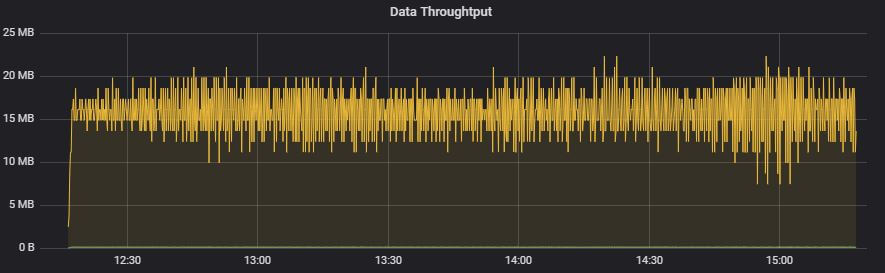
This graph represents the amount of data transferred from the server to the client per unit of time. The transferred data is measured in terms of bytes per second, KB per second, MB per second etc.
A throughput graph is used to find out network-related issues like low bandwidth. A drop in the throughput graph also denotes the issue at the server end especially queuing issue, connection pool issue etc. The throughput graph needs keen investigation with other graphs to get understand whether the issue is with network bandwidth or at the server end.
Tool-specific term:
- LoadRunner: Throughput Graph
- JMeter: Bytes Throughput Over Time Graph
- NeoLoad: Total Throughput Graph
4. Hits per second Graph

Hits per second Graph refers to the number of HTTP requests sent by the user(s) to the Web server in a second. Always remember, there is a difference between Transactions per second and Hits per second in terms of performance testing. To provide more detail, a transaction is a group of requests which creates multiple hits on the server. Hence you may see multiple requests (hits) against one transaction. The hits per second graph help to identify the request rate sent by the testing tool. High response time may cause less HPS.
Example: A login operation which involves 10 HTTP requests can be grouped together into a single transaction, so when you see 1 dot in the ‘Transaction per second’ graph there will be 10 dots in the ‘Hits per second’ graph.
Tool-specific term:
- LoadRunner: Hits per second Graph
- JMeter: Bytes Hits per second Graph
- NeoLoad: Total Hits Graph & Average Hits/sec Graph
5. Transactions per Second Graph

TPS aka Transactions per second graph represents the number of transactions executed per second. During the test, while doing live monitoring Transactions per second (TPS) graph helps to keep the eyes on the transaction rate. If you have TPS SLA then you need to prepare the workload model in such a manner so that it can maintain the defined TPS; neither more nor less. TPS can be controlled by setting proper pacing in the test scenario. High response time may lead to less TPS.
Tool-specific term:
- LoadRunner: Transactions per second Graph
- JMeter: Transactions per second Graph
- NeoLoad: NA
6. Error Graph

The error graph shows the number of errors identified during the test. Error Graphs could be quantitative as well as descriptive. The quantitative error graph shows the error count and occurrence at a particular time and the descriptive error graph shows the error message in detail, which helps to find the root cause. The merging of the Error graph with other graphs like response time, throughput graph etc. gives a clear picture and helps to identify the bottleneck.
Tool-specific term:
- LoadRunner: Errors per second Graph and Errors per second (by Description)
- JMeter: Error (in Tabular format) and Top 5 Errors by sampler
- NeoLoad: Total Error
7. CPU Utilization Graph

Moving towards the server side, the first metric is the ‘CPU utilization graph’ which shows the percentage of utilized CPU. The stats of server-side metrics are noted for the pre-test, during the test and post-test period, so that utilization percentage can be compared.
The server monitoring tool captures the resource utilization. CPU is one of the resources among them. These monitoring tools can be agentless, agent-based or in-built with the server.
8. Memory Utilization Graph

The purpose of the memory utilization graph is similar to the CPU utilization graph. The only difference is that we check the memory status during the test in this graph. The pre-test, during the test and post-test period, helps to determine the memory leakage in the system. Memory utilization graphs are captured by monitors which can be agentless, agent-based or in-built with the server.
Conclusion:
Please note the above-mentioned analysis steps are very generic and may help you to understand the basics of Performance Test Result Analysis. This particular post is useful for a new performance tester to understand the terms used in the analysis. The topic of performance test result analysis is very vast and needs practical experience along with theoretical knowledge. So, you can get the theoretical knowledge at PerfMatrix and do the practice on your own. Refer to the next post to deep-down more into the analysis part.